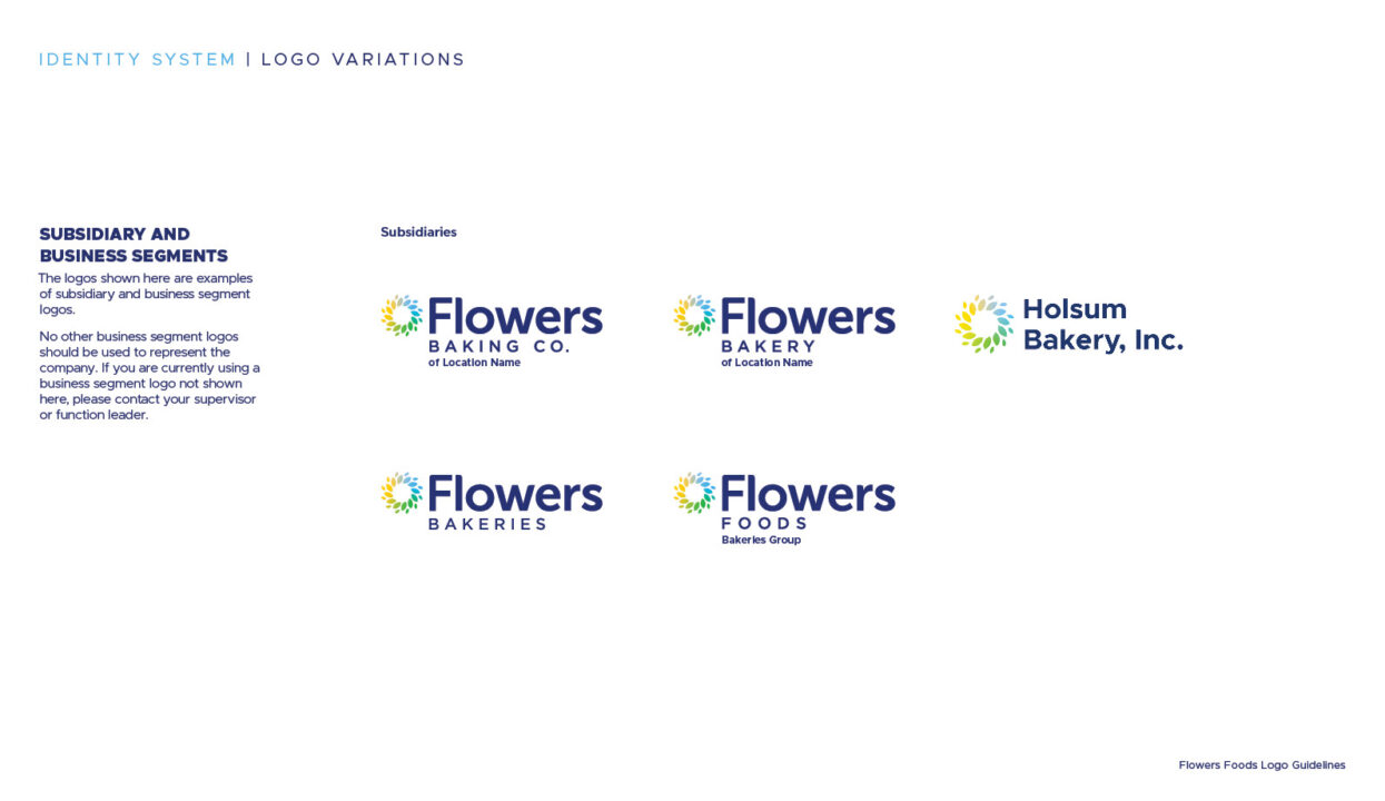
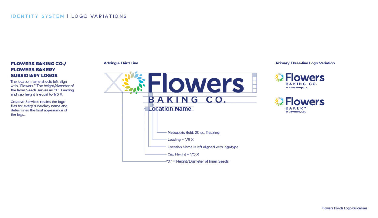
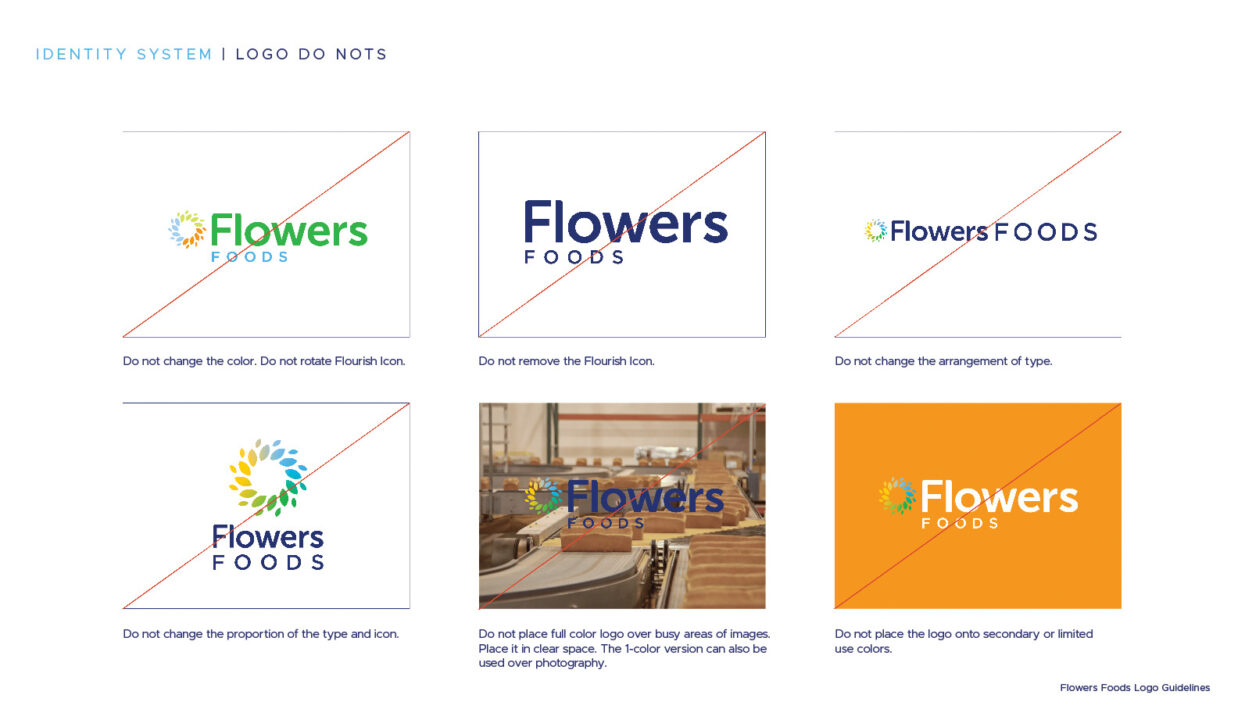
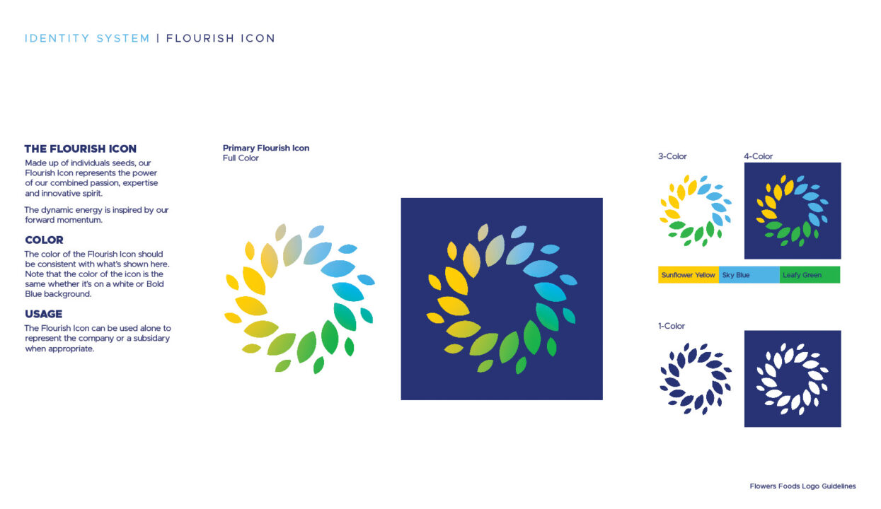
Branding Work
Flowers Foods
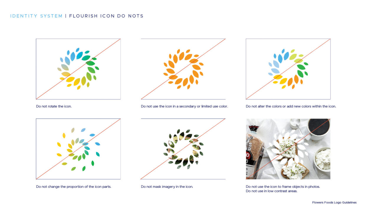
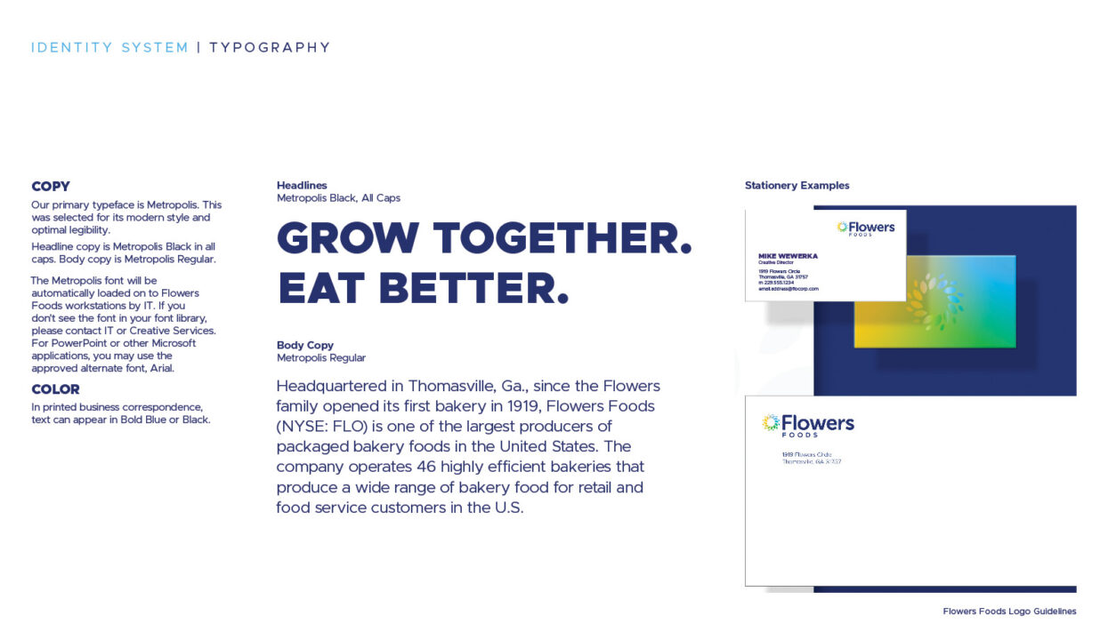
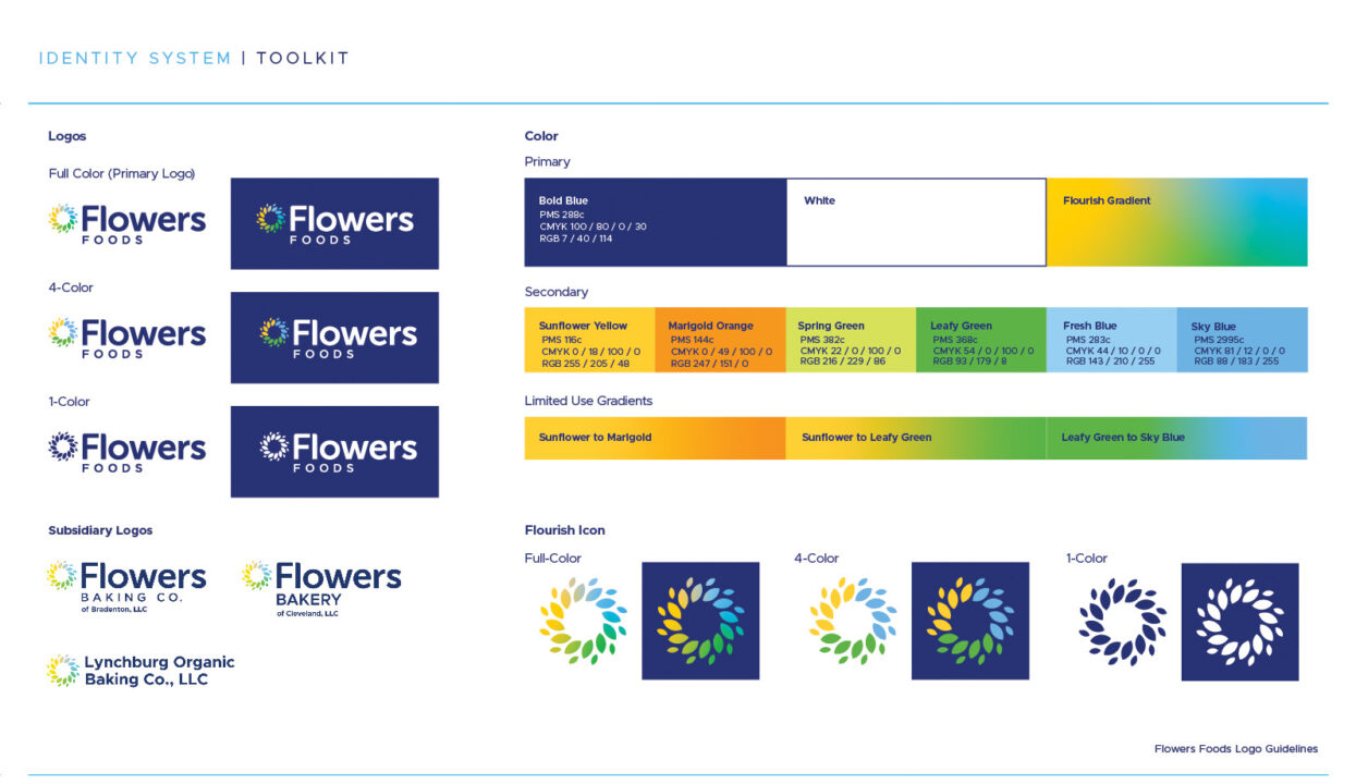
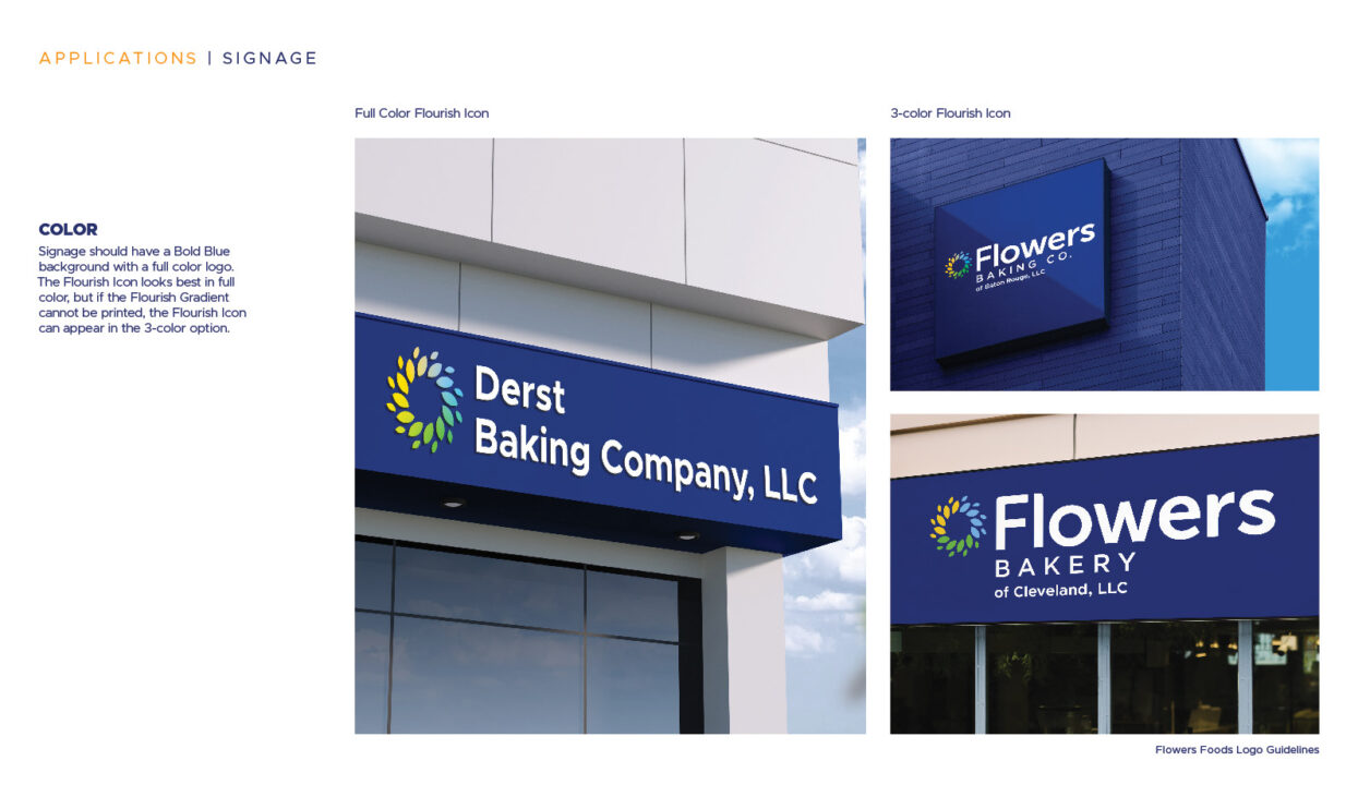
Rebranding of iconic logo marks.
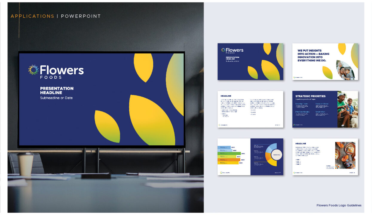
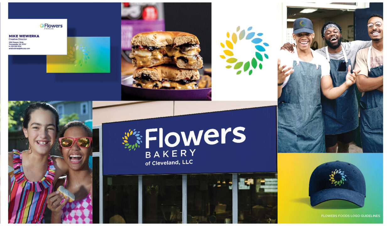
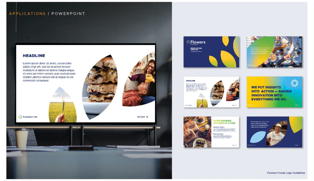
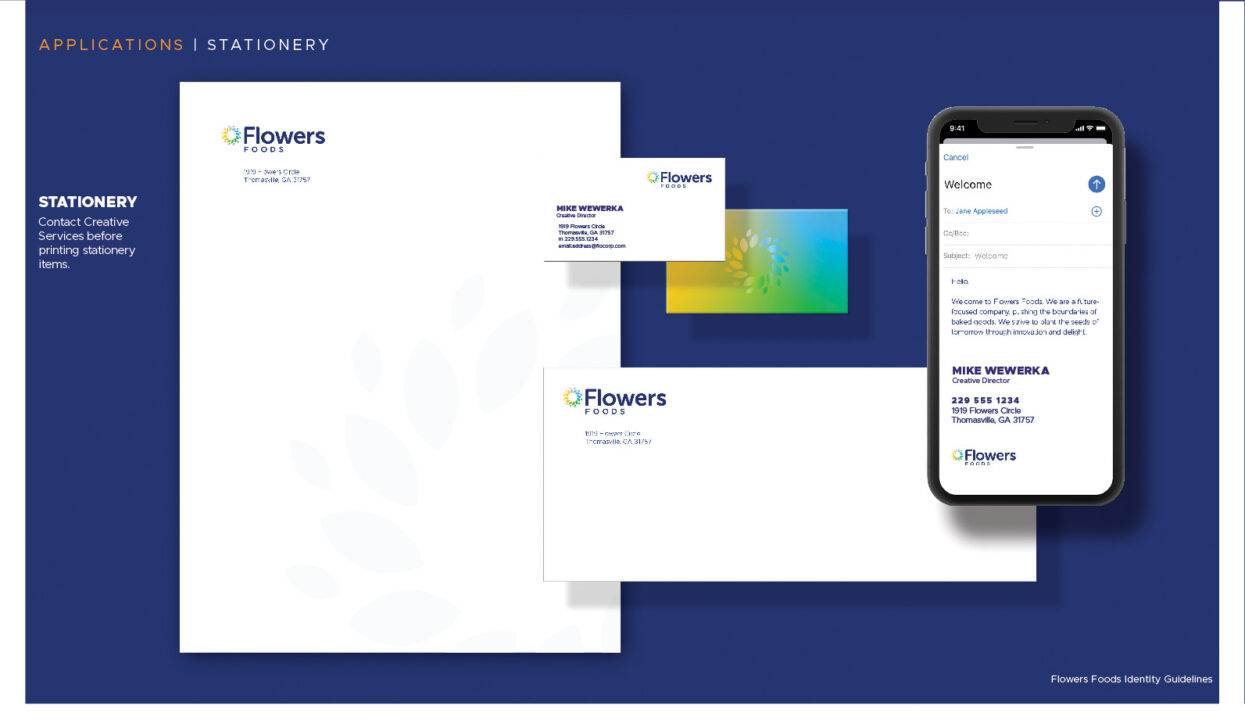
Flowers Foods celebrated its 100-year anniversary and our team was tasked with creating a new logo, brand guidelines, and color palette that would be used company-wide, both internal and external facing.
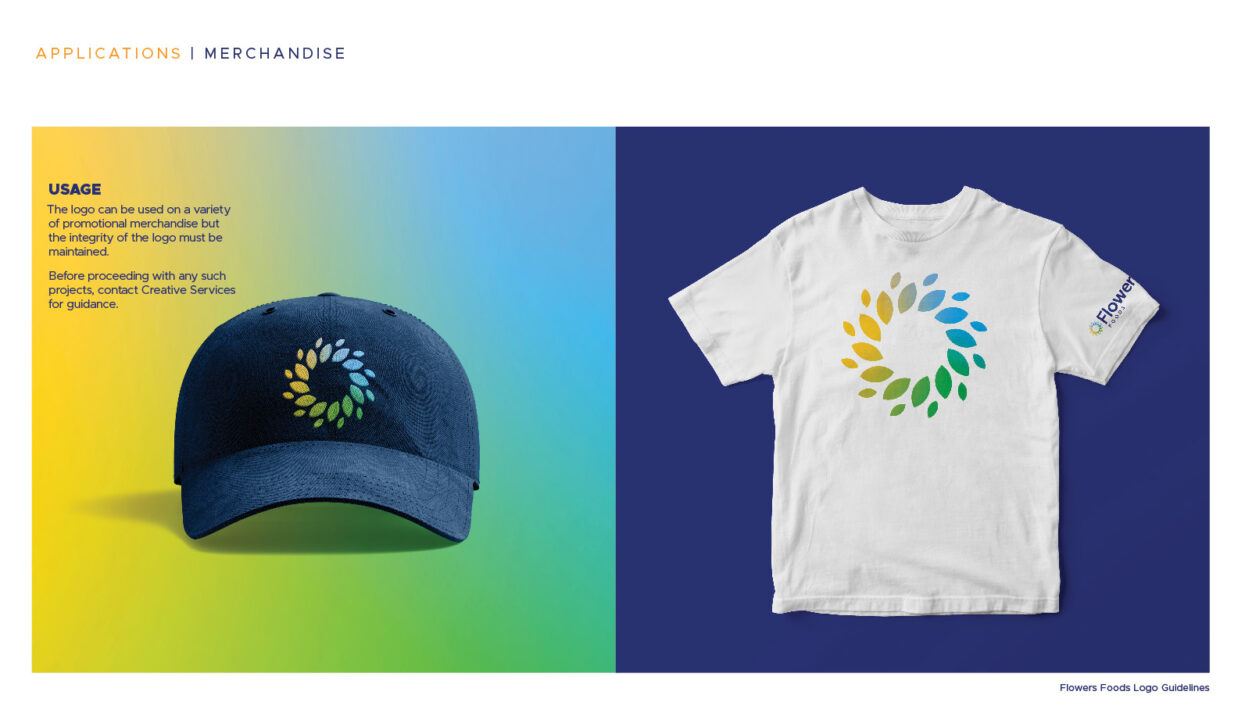
We created not only created a new logo mark we also gave the logo a new clean, sans-serif font and color palette that was both bright and modern. As part of the project, we constructed mock-ups of all types of usage including, flags, exterior signage, apparel, and more. With the new logo, we also created a new mission statement along with a brand statement of “Fresh. Forward. Flowers.” To cap off the launch of the new logo rebrand, we shot and edited a new announcement video, which can be seen below.


Wonder Bread
After acquiring Wonder Bread from Hostess in 2013, Flowers Foods decided to update the logo in 2018, which was my first major project for the company. Together with my team, we decided to go with a new softer, and more child-like logo with rounded edges and a color palette that was less “highlighter-like” and go with softer primary colors. This approach allowed us to keep Wonder’s well-known and iconic look, allowing customers to immediately recognize it, despite the change, while still giving it a more modern appearance.